Information Design
According to Scott Klemmer and Michael Bernstein, there are different ways that we could create designs for text-filled things.
A sample of the before-editing invitation can be seen below.
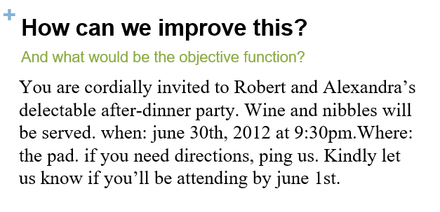
Sample image of the contents on the invitation
Whitespace conveys grouping
To further improve designs, whitespaces has an important role. They show how elements are divided to each other. Narrow whitespaces show how elements are closely related to each other while wider whitespaces shows how elements differ from each other.
Robert Bringhurst, Elements of Typographic StyleContrasts indicate hierarchy
According to Edward Tufte, "Information consists of differences that make a difference." In text elements, sizes create hierarchy. The bigger the text is, the more readers read it. Most people do not bother reading small texts because they can be hard to see especially in print. Same as font sizes, text weights indicate readability. The more the text is bold, the more it gets noticed.
Edward Tufte, Envisioning Information
Sample image of the contents on the invitation
What did I edit?
1. Typography
Since the main objective of this invitation is to show whose party it is, "Robert" and "Alexandra"'s names should be the most noticeable one. Their names are bigger which means it is the important element in the invitation. "The Pad", where the event will happen, is slightly larger that the other text in the invitation since it is the second most important element in the invitation.
2. Positioning
Since most people read from left to right, we start positioning texts from the left.
3. Template
The design of the invitation should be related to what is the objective of the invitation. Since it is about an after-dinner party, most after-dinner parties are of professional events. A bottle of wine could represent a simple party for after a wedding.