Userinyerface - Worst UI Practice
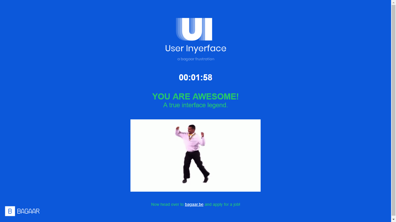
At first, I thought that the quiz would be a typical one, but no, not this one. I was surprised when we started opening the webpage (userinyerface.com). I didn’t know what to do. I was clicking all over the place but then Miss Jen told us that it is a design-related quiz, since our subject is User Design. Then, I understood that this is logical type of quiz.
Users need to understand how the website works and what should be clicked to get through the different pages. An important aspect of creating an application is that is should be easy for users to navigate through different windows or pages of your applications. Your application will not be popular to the masses especially there are different type of users that would use your app.
User Interface design of each page got trickier and trickier. From a simple “click here” button to the complex captcha-style button clicking. The hardest page I went through was the email and password one. At first, it took me more than two minutes to find out how to get out of that page. I even scrolled through the terms and condition window and still couldn’t get out of it since it scrolls very slowly.
It was a fun activity and it let us open our minds to create a better user interface for our applications.